Petventure
Role: UX/UI Designer
Duration: Dec 2024 -January 2025
Toolkit: Figma, Figjam, UXTweak
Overview
This is a school project with Designlab, where I designed an MVP for an end-to-end application called Petventure. The app is designed to make traveling with pets stress-free and enjoyable. It offers a self-service platform for discovering pet-friendly destinations and creating personalized itineraries, empowering pet owners to confidently plan unforgettable adventures with their furry companions.
Problem
While 70% of U.S. households own pets and 78% of pet owners travel with their animals annually, planning a pet-friendly trip remains a challenge. Existing apps like Rover and BringFido cater to specific needs, such as pet sitting or locating accommodations, but there isn’t a comprehensive app that allows users to plan an entire trip with their pets. Pet owners are left juggling multiple tools to map travel routes, find pet-friendly stops, and ensure their pets' needs are met, making the process inefficient and frustrating.
Solution
Petventure provides users with a comprehensive trip-planning experience. The app enables users to map travel routes, discover pet-friendly accommodations, restaurants, and attractions, and create personalized itineraries. This all-in-one trip planner eliminates the inefficiencies of relying on multiple tools, making pet travel seamless and convenient.
Research
As a pet owner and traveler myself, I understand the struggles of traveling with pets. But do other users feel the same way? To gain deeper insights into user pain points and challenges, I conducted user interviews and a competitive analysis, which revealed valuable findings.
Competitive Analysis
I conducted a competitive analysis of four popular pet travel apps, chosen for their high ratings and focus on pet travel. These apps offer pet-friendly location reviews and directories, but none provide a dedicated trip planner feature for pet owners. In my search for apps to analyze, I observed that many apps focus more on services like pet boarding and care, rather than comprehensive trip planning. Additionally, general travel apps like Roadtrippers and TripIt offer pet-friendly filters but are not designed specifically for pet owners. These insights underscore the need for an app that provides a complete travel planning experience for pet owners.
User Interviews
To understand how pet owners plan trips with their pets and the challenges they face, I conducted interviews with five participants. While most had experience traveling with pets, they found existing apps like Rover and BringFido unreliable due to outdated or inaccurate information. Many relied on manual research through Google instead. Road trips were preferred over air travel, with participants citing concerns about their pets’ well-being and unclear travel policies. Overall, finding accurate, up-to-date information on pet-friendly accommodations, policies, and stops was a major pain point, making the process stressful and time-consuming.
Affinity Map
To uncover broader patterns and themes, I synthesized these insights using an affinity map. This deeper analysis revealed recurring challenges and user needs that informed opportunities for design. The affinity mapping process highlighted the following key themes:
These findings underscore the need for a comprehensive pet travel app that simplifies planning by providing real-time updates, transparent policies, and tailored recommendations.
Define
Now that user research has been complted and the problem has been identified it was time too look at user personas and POVs and HMWs.
User Personas
I created 2 personas. Rachel loves road trips and outdoor adventures with her dog, Buddy, but finds trip planning stressful and time-consuming due to outdated and unreliable pet-friendly information. David enjoys weekend getaways with his dog, Titan, but struggles to find accurate details about pet-friendly options, especially for larger dogs, and avoids air travel due to safety concerns. For this project, I will be focusing on persona Rachel as she addresses more of a wider audience who are looking for more of a reliable and convenient way to pet travel.
POV and HMW
To address their challenges, the guiding question becomes:
How might we create a reliable and consolidated platform that simplifies pet travel planning by providing accurate, up-to-date information, reducing stress, and making the process more efficient for pet owners?
Ideate
During the ideation process, I go back to my personas and focus on user pain points, needs, and goals to create my feature set and user flows.
Card Sorting
Before creating my feature set and deciding what to prioritize, I decided to use a card sort to gain insights into user preferences. I realized that asking users directly about what they like and dislike would be the most effective approach. The purpose of the card sort was to understand how users categorize information and determine their priorities regarding specific pet travel features. Unmoderated testing was conducted using 19 cards displaying potential features, which users categorized into four groups: Not Interested, Like, Love, and Neutral.
Card Sorting Results
I was surprised by the results of the card sort. While I anticipated that users would prioritize features like pet-friendly accommodations, restaurants, and attractions, I didn’t expect the high interest in an “emergency vet and clinic locator” and “vaccine and medical record storage.” These features hadn't come up during user research, where participants emphasized the importance of a comprehensive search bar, interactive maps, a travel planner, and a checklist. The only mention of pet health or safety during the research was in relation to weather conditions affecting pets. This unexpected finding highlights the importance of exploring diverse feature ideas during the design process.
Feature Set
After reviewing the results of my card sort and analyzing insights from user interviews, I decided which features to prioritize for the design.
Must Have Features:
-
Comprehensive list of pet-friendly hotels, parks, restaurants, and attractions.
Why a priority?
Pet owners need a reliable source for finding accommodations, parks, restaurants, and attractions that welcome pets.
This directory ensures they have easy access to key information when planning trips.
-
Customizable itinerary builder with pet-specific preferences
Why a priority?
Helps pet owners plan their travels while considering their pets' needs, making the experience smoother and more enjoyable for both the pet and the owner.
-
A visually engaging and user-friendly landing page that sets the tone for the website.
Why a priority?
It serves as a quick, accessible guide for users to easily locate pet-friendly places.
It enhances user experience by allowing them to explore various destinations in one place.
-
An advanced filtering system that allows users to narrow down search results based on specific criteria like location, pet size, amenities, and more.
Why a priority?
An advanced filtering system is essential for users to refine their search based on specific needs like location, pet size, or amenities.
This customization ensures a more tailored experience and saves time, providing pet owners with precisely what they need.
Mid to Low Priority Features:
-
Suggested packing lists tailored to the trip and pet type.
Why mid priority?
Though useful, packing checklists are generally considered a supplementary feature.
For an MVP, the primary goal is to help users easily plan and book trips.
A checklist feature can be added later once the core functions are working well.
-
Access to nearby vets, pet hospitals, and emergency services.
Why a mid priority?
This is a valuable feature for users who travel with pets, but it may not be immediately necessary in the MVP.
While emergency access is important, users may prioritize finding pet-friendly accommodations and activities over emergency services when they are just starting their trip planning process.
-
A secure feature that allows users to upload, store, and access their pet’s vaccination records and important travel documents description
Why a mid priority?
While important for long-term use, this feature doesn't directly impact the core functionality of trip planning.
It could be valuable for users but might not be essential in the MVP phase, where the focus is on booking, itineraries, and finding pet-friendly places.
-
Download maps, guides, and emergency info for offline use.
Why a low priority?
Offline access could enhance user experience, especially during travel.
However, since it’s a non-essential feature for trip planning, it can be considered a lower priority for an MVP.
User Flows
After prioritizing my feature set, I began designing my user flows. These flows helped outline the core journey users would take when interacting with the app, guiding the structure for my low-fidelity wireframes.
Design
After creating the user flows, I began designing the wireframes.
Low Fidelity Wireframes
Once the user flows were in place, I moved on to creating the low-fidelity wireframes. The goal at this stage was to visualize the basic layout and user flow, particularly for key features like the trip itinerary planner, interactive map, and pet-friendly directory. This provided an early visual representation of how users would interact with these features.
Testing Low Fidelity Wireframes
Early user testing was completed to determine any pain points users might have in regards to the design and flow.
Key insights include:
Users suggested adding a destination, date, and title when creating a trip to improve clarity.
The hero section needed to be more engaging.
The itinerary layout was well-received, but users preferred distinct icons for each destination type.
Simplified hotel details and the pet policy description were appreciated.
While most found navigation easy, some struggled with the flow and map icons, especially during the accommodation and restaurant addition tasks.
Users also requested more restaurant options in the listing.
Because there seemed to be a lot of confusion regarding the flow of the designs, I had to revisit my user flows before moving forward.
Revisiting my User Flows
During this phase of the project, I realized the importance of creating clear and well-thought-out user flows before starting my wireframes. My original user flows were less effective than I had anticipated, which led to confusion during the testing of my low-fidelity wireframes, from users and mentors. This experience underscored the necessity of having a strong, clear user flow as the foundation for the design process. Below is my updated user flow.
With my user flows now refined, I revisited my previous wireframes and updated them in preparation for high-fidelity mockups.
High Fidelity Wireframes
High-fidelity mockups were created based on feedback from low-fidelity user testing. The designs showed major improvements in layout and UI elements. The flow for completing tasks was also refined to reduce confusion during high-fidelity wireframe testing.
Testing/Prototype
Five users with a history of traveling with their pets tested the usability of the high-fidelity mockups. The testing revealed that users found the website easy to navigate. Tasks such as creating a new trip, exploring accommodations in Vegas, and adding a restaurant to the trip were completed efficiently.
One user, who had previously tested the low-fidelity wireframes, also tested the high-fidelity mockups and noted significant improvements in the design flow of Task 3 (adding a restaurant to their itinerary), stating:
"Compared to the last one I tested, this is so much better to navigate."
-Mathew, Age 31
This user took about 2.48 minutes to complete Task 3 in the low-fidelity mockups, whereas they completed the same task in just 24.82 seconds in the high-fidelity mockups, showing a significant improvement in completion time.
Iterations
Though I received great and positive feedback on my high-fidelity mockups, there were still some suggestions for improvement to make the design even better.
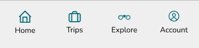
Updated Navigation Bar
Users had difficulty finding their Las Vegas trip, with two users mistakenly clicking on 'Trips' instead of the 'Home' page. To reduce confusion, the 'Home' and 'Trip' icons have been updated to 'My Trips' and 'Favorites'.
Before
Itinerary Add-on Icons Updated
Users were not fond of the random colored icons, as the mix of colors caused confusion and made it unclear if the icons were related. Additionally, users had difficulty locating the restaurant icon. To improve clarity, the icons were updated to use a single color for consistency, and the 'Places to Eat' label was changed to 'Restaurants.
Before
Trip Selection Defaulted
Users found it redundant to select their trip again on this screen, as they had already chosen it earlier. To streamline the process, the previously selected trip is now set as the default on this screen.
Before
After
Major Changes to Destination Information Page
Users were frustrated by the inability to navigate back to previous screens. They also felt that the picture and text fonts were too small, and requested easier access to social media for more information about destinations.To address these concerns, back buttons were added, the picture and font sizes were increased for better accessibility, and social media icons were added for easy access.
Before
Conclusion
This app solves the challenges pet owners face by providing a user-friendly platform for seamless trip planning. It centralizes pet-friendly accommodations, restaurants, and activities, eliminating the need to switch between multiple apps. Clear information on pet policies, personalized features like enhanced filtering options make trip planning quicker and easier. Improvements such as larger fonts, better navigation, and visually appealing designs ensure a smooth experience. By simplifying workflows, offering reliable details, and reducing frustration, the app empowers users to confidently plan stress-free trips with their pets.
Since this is an MVP aimed at addressing the general pain points of users, not all features were fully developed to reach the app's full potential. Future feature enhancements are being considered to make the app even more enjoyable and helpful for users. These include adding a pet travel checklist, locating emergency vets, and providing a pet vaccination storage area, among other possibilities.
Key Insights for Completing This Project
After
Other Iterations
Several updates were made to enhance the design's visual appeal and functionality, including adding back buttons for easier navigation, increasing font sizes and pictures for better readability, and updating layouts to align with modern design patterns. Padding was adjusted for consistency, the navigation bar was fixed to direct users correctly, and items were converted into components for reusability. Additionally, the prototype was carefully linked to ensure a seamless flow, minimizing navigation issues and creating a more polished, user-friendly experience.
Final Designs
As my final project at Design Lab, I’ve had the opportunity to showcase the growth and skills I’ve developed throughout the program. I’ve learned the importance of design processes, the patience required for participant recruitment, and the value of constant iteration. Most importantly, I’ve come to appreciate the balance of accepting both constructive criticism and praise, all of which have contributed to my development as a designer.